|
|
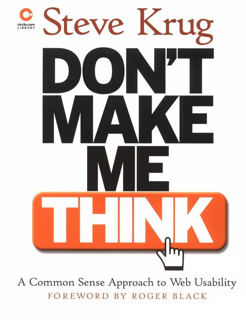
DON’T MAKE ME THINK A Common Sense Approach to Web Usability Steve Krug New Riders Publishing, Indianapolis, 2000, 195 pp. |
|
|
|
||
|
Novices and experts can find helpful tips in this well-illustrated, practical book. For example, I learned what everybody already knows, that a home page has to tell you “what site this is and what it’s for.” (97) And the book is fun. Krug says it’s small because you don’t need to know everything! After all, “It’s not rocket surgery.” The overriding principle is to make your web site “self-evident. Obvious. Self-explanatory.” (11) Remove as many questions as possible from the mind of the person looking at a page. You want to avoid someone thinking, “Hmm, I wonder what this site is about?, I wonder what this is?, and I wonder whether I can do ____?” For example, is a button obviously a button or does it look like it might be something else so the person has to ask, “Is this a button?” A visitor to a site shouldn’t have to ask or spend time thinking about: - “Where am I? - Where should I begin? - Where did they put ____? - What are the most important things on this page? - Why did they call it that?” (17) Designers think people read, even study, web pages. What they do is scan (like reading a billboard at 60 miles an hour) and click on the first thing that looks remotely like what they are looking for. This affects how web pages should be designed. People don’t bother to figure out how things work, they “muddle through,” and tend to stick with whatever worked the last time. (26) Therefore, create a clear visual hierarchy using prominence, visual relationships, and nesting; follow conventions; break up pages into clearly defined areas; make obvious what is clickable, etc. (31-39) “Users don’t mind a lot of clicks as long as each click is painless and they have continued confidence that they’re on the right track.” (41) Prune. Get rid of needless words, happy talk” (fill-in, stuff the reader sees as blah blah blah), and instructions. (45-47) Chapter 6 is along section on navigation: knowing where you are, searching, and finding your way around. The Home Page is critical but impossible but it has to accommodate: - “Site identity and mission - Provide the site hierarchy - Search - Teases - Timely content - Deals - Short-cuts - Registration - Show me what I’m looking for - And what I’m not looking for - Show me where to start - Establish credibility and trust” (97-98) “The one thing you can’t afford to lose in the shuffle—and the thing that most often gets lost—is conveying the big picture,…what the site is.” (100) “What is this? What do they have here? What can I do here? Why should I be here—and not somewhere else?” (101) “The ‘main point’ is the one thing nobody inside the organization will notice is missing.” (105) “A tagline is a pithy phrase that characterizes the whole enterprise, summing up what it is and what makes it great.” Good tag lines are clear, informative, and just long enough. They convey differentiation and a clear benefit. They are personable, lively, and sometimes clever. (105-7) The one page that should not load slowly is the home page. (117) “Left to their own devices, web development teams aren’t notoriously successful at making decisions about usability questions.” (131) Everyone has strong convictions about what people like in a web site – that pretty much represent what we like. The key is to “build some version of the thing and then watch ordinary people carefully as they try to figure out what it is and how to use it.” (137) The last three chapters are about what, why, and how to test. A couple of key points: - Testing one user is 100% better than testing with none. - Testing one use early in the project is better than testing 50 near the end. - The point of testing is not to prove something but inform your judgment. - Testing is an iterative process (Test. Change. Retest. Change….) - Nothing beats a live audience reaction. (142-3) “If you want to know whether your software or your Web site or your VCR remote control is easy enough to use, watch some people while they try to use it and see where they run into trouble. Then fix it, and test it again.” (143) Krug includes a brief annotated bibliography about information architecture, how people shop and make decisions, and web testing. |
||
