|
NieHome
03-9-98 |
||||||||||||||||||||||||||||||
|
|
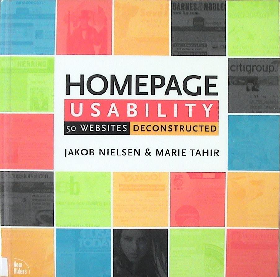
HOMEPAGE USABILITY 50 Websites Deconstructed Jakob Nielsen & Marie Tahir New Riders Publishing, 2002, 314 pp. |
|||||||||||||||||||||||||||||
|
Nielson has been called the world’s leading expert on web
usability. This book introduces 113
guidelines but it primarily analyzes web site home pages from 50 top
companies. Each web site is displayed
and 20 key components are evaluated. This is the most colorful book I’ve
seen. Every glossy page is full
color. Its 10 x 10 soft cover format
is suitable for displaying web pages but makes it awkward to hold and read. “Homepages are the most valuable real estate in the
world. Millions of dollars are
funneled through a space that’s not even a square foot in size. The homepage’s impact on a company’s
bottom line is far greater than simple measures of e-commerce revenues: the
homepage is also your company’s face to the world.” “The homepage is the most important page on any website, getting
more page views than any other page.”
(Preface) “The most critical role of the homepage is to communicate
what the company is, the value the site offers…, and the products or services
offered.” (Preface) “Inexperienced users often feel overwhelmed by homepages
that don’t clearly help them understand their options.” “They will just leave the site and turn to
places that feel more welcoming.”
(Preface) “The challenge is to design a homepage that allows access
to all important features without cramming them onto the page itself…. Focus and clarity are key, as is an
understanding of users’ goals.” (Preface) Communicating the Site’s Purpose. (10) “Imagine how disorienting it would be to walk into a store
and not be able to tell immediately what services or goods were available
there.” (10) ·
“Show the company name and/or logo in a reasonable
size and noticeable location ·
Include a tag line that explicitly summarizes what
the site or company does. ·
Emphasize what your site does that’s valuable from
the user’s point of view…. ·
Emphasize the highest priority tasks so that users
have a clear starting point.” Content Writing (14)
“Most users scan online content, rather than carefully
reading, so you must optimize content for scannability and craft it to convey
maximum information in few words.”
(14) ·
Use customer-focused language. Label sections and categories according to
the customers’ values, not yours. ·
Avoid clever phrases and marketing lingo ·
Use only imperative language. Revealing Content Through Examples (16)
·
Use examples to reveal the site’s content, rather
than just describing it. ·
For each example, have a link that goes directly to
the detailed page Links
·
Differentiate links and make them scannable. ·
Don’t use generic instructions, such as ‘Click Here’
as a link name. Instead underline the
text that shows what they will get when they click. Graphic Design (23) “Graphic design most often hurts usability when it’s used
as a starting point for the homepage design, rather than as a final step to
draw appropriate focus to a customer-centered interaction design.” “Over-designed text can actually detract
from the meaning of the words.” Window Title
The window title (determined by the TITLE tag of each HTML
document, plays a critical role in bookmarking and finding the site with
search engines. The window title
becomes the default bookmark name, so the title should begin with the word
that users will most likely associate with the site. (25) URLS
Keep homepage URLs simple and memorable. (26) Technical Problems
“If the website is down or important parts not operational, show it clearly on the homepage and give an estimate of when it will be corrected. (30) Dates and Times
Users need to see that the information they see on your homepage is current. (33) Recommended Homepage
Design (52-53)
Another good book on web sites: DON’T MAKE ME THINK - A Common Sense Approach to Web Usability, Steve Krug, 2000. |
||||||||||||||||||||||||||||||
